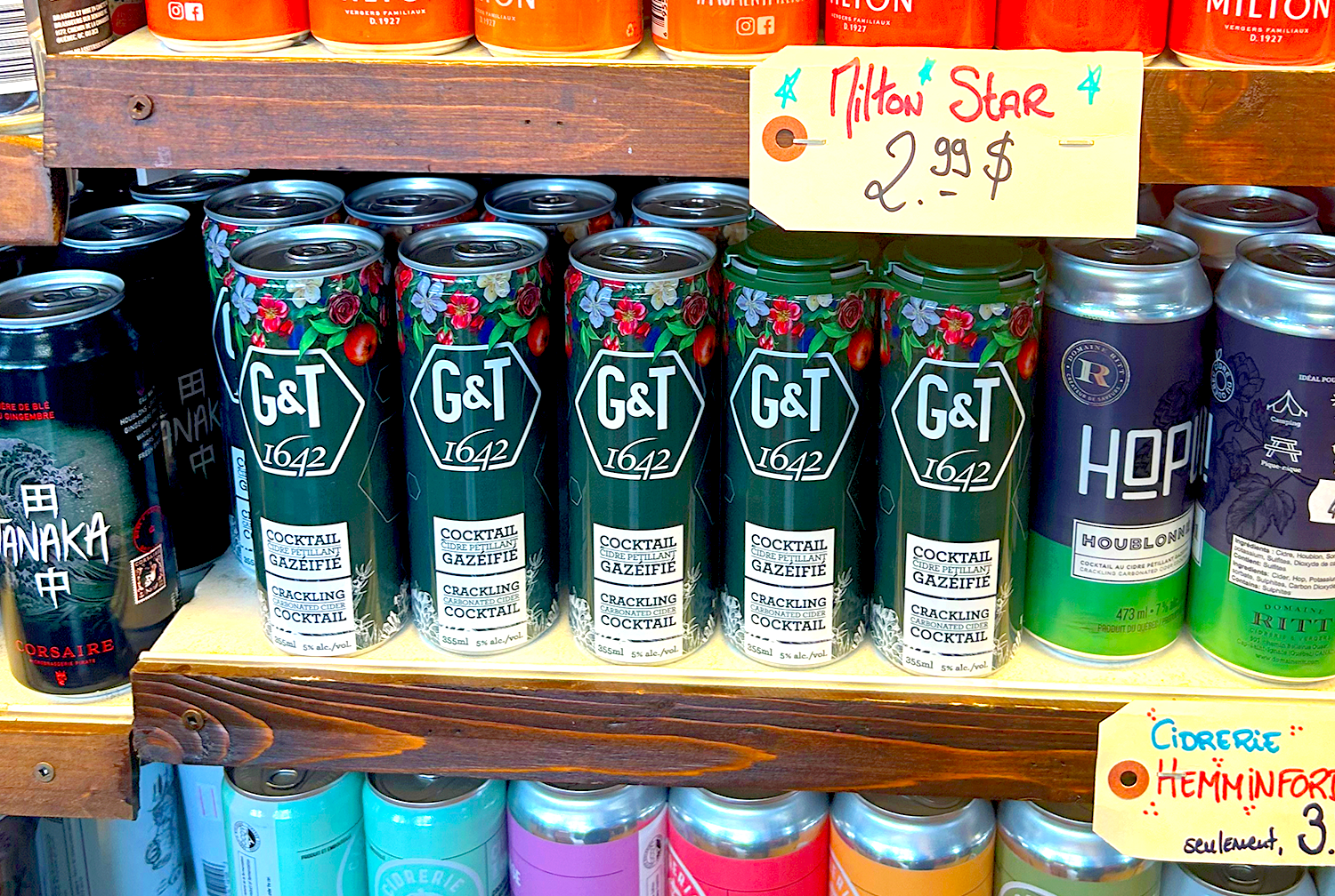
Cidrerie Milton, celebrated for its exceptional ciders, and 1642, Québec’s artisan tonic water pioneer, join forces to create G&T, a cider-tonic cocktail that embodies the bold, innovative spirit of Québec. Combining Milton’s crisp, handcrafted apple cider with 1642’s refreshing tonic water, G&T redefines the art of mixology with a beverage that’s both sophisticated and refreshingly local.
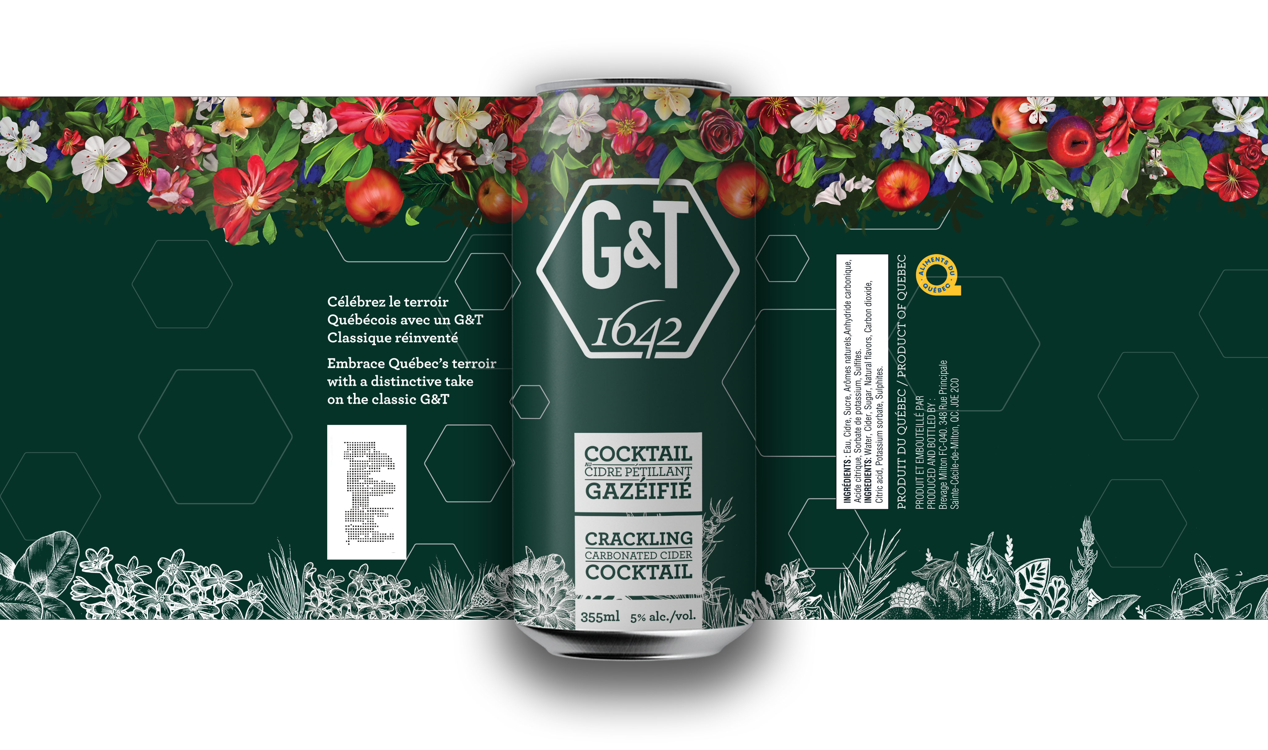
The goal was to craft a brand that celebrates the heritage and innovation of two iconic Québec producers. The product needed to:
• Communicate the fusion of two distinct yet complementary flavors.
• Designed for dynamic urbanites and creative minds craving a cocktail as versatile as their lifestyle.
• Stand out on shelves with distinctive packaging that reflects both brands’ personalities.
Creative Process
1. Research & Concept Development
We explored the rich history of cider and tonic water in Québec, focusing on the values that Cidrerie Milton and 1642 share: quality, authenticity, and boldness. Our inspiration stemmed from Québec’s duality—a balance of tradition and innovation.
2. Branding
The name G&T encapsulates the essence of this collaboration with a sleek, minimalist charm. The simplicity of the name reflects its effortless blend of Gin and Tonic, while subtly nodding to its premium origins in Cidrerie Milton and 1642 Beverages.
3. Typography:
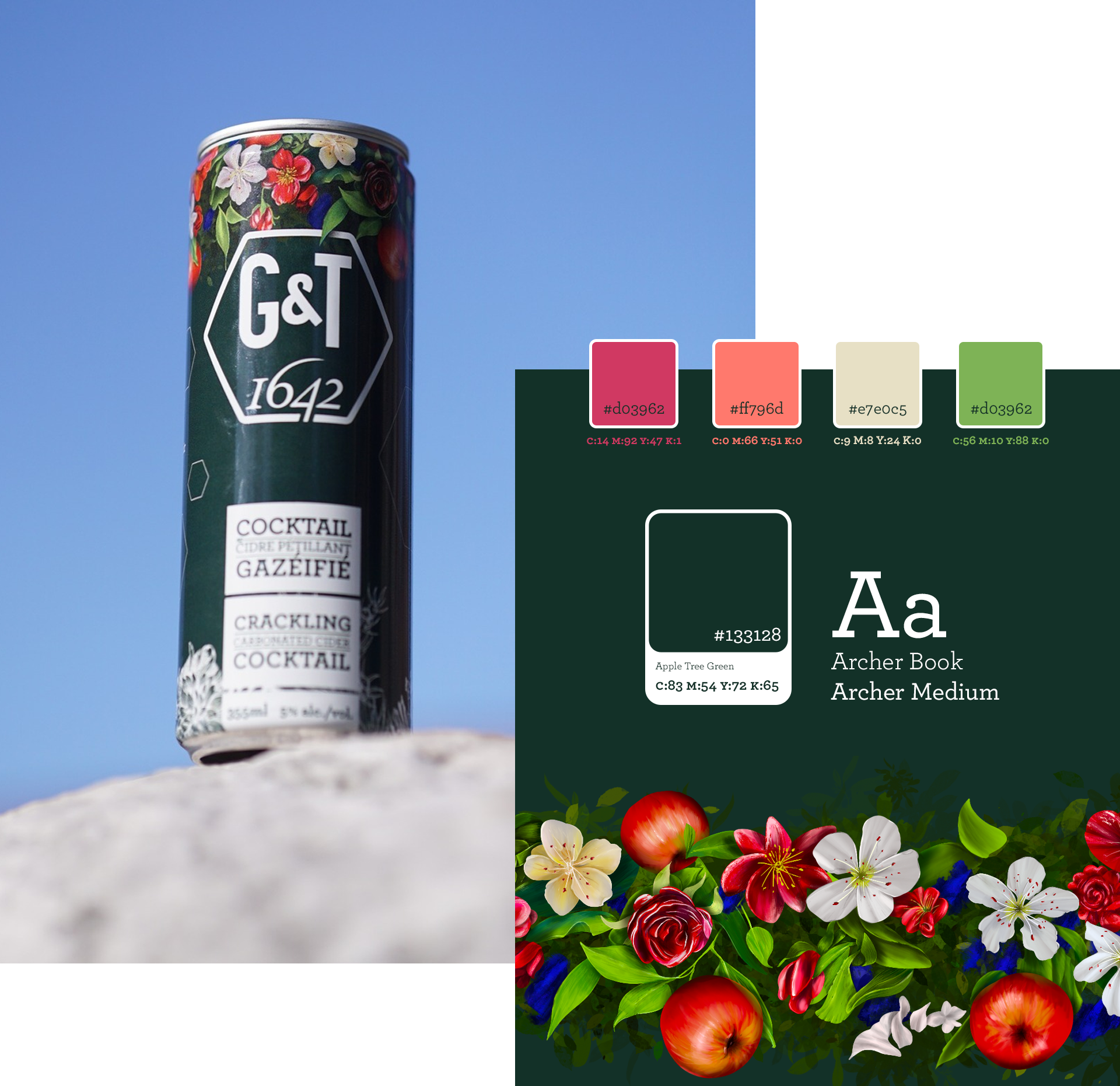
• Primary Typeface: A bold, clean sans-serif conveys modernity and confidence, appealing to the urban and creative demographic.
• Accent Typeface: A refined serif font is used sparingly, evoking the heritage and artisanal roots of both brands.
4. Colors:
Warm golds for cider and vibrant teal for tonic, creating a refreshing and dynamic visual appeal.
Handcrafted Elegance
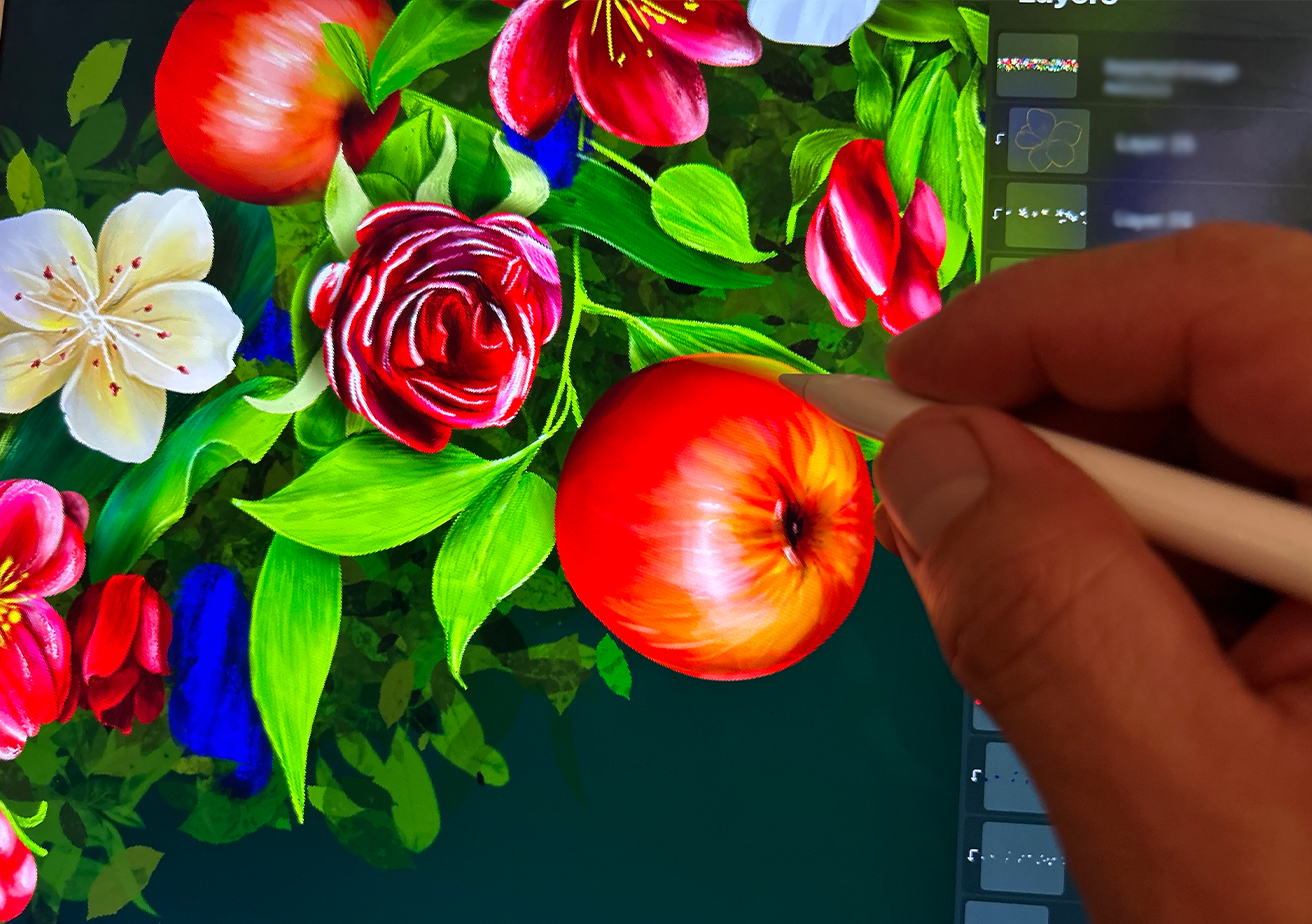
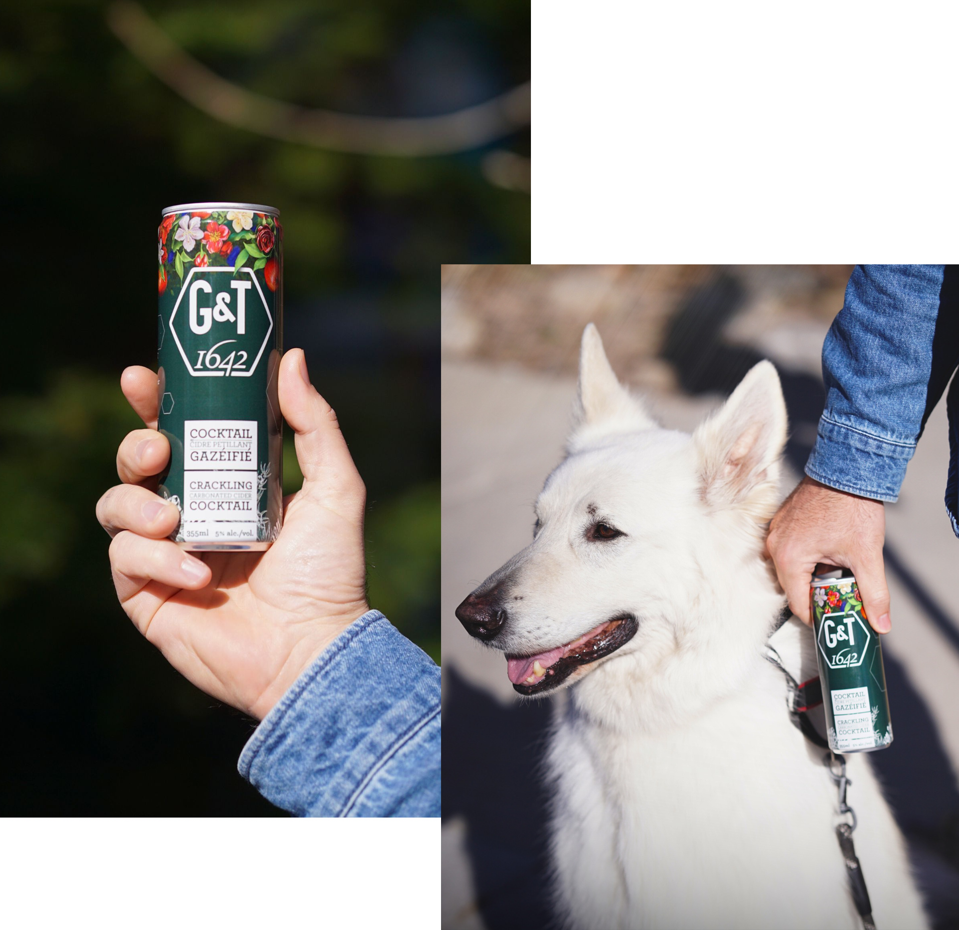
Every aspect of this project was designed with meticulous care, exceeding client expectations and elevating the product's presence at the point of purchase. Each illustration was crafted with a blend of precision and artistry, drawing inspiration from my long-standing passion for botanical design. This project offered the perfect canvas to infuse life into each delicate line, celebrating the drink’s noble character through a vibrant and authentic visual story.
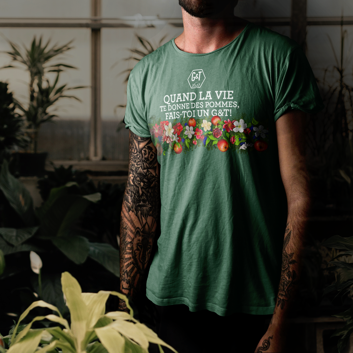
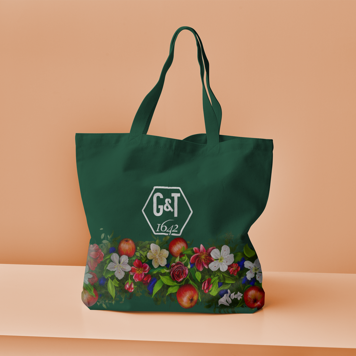
A new Brand direction that creates a relevant customer experience.
G&T is more than just a drink—it’s a celebration of Québec’s rich heritage and creative future. The custom illustrations brought the product to life, connecting audiences to the story of two beloved local brands coming together to create something exceptional.
